Say hello to the new SignComp Europe
- Jul 21, 2025
- 4 min read
Updated: Aug 29, 2025
You may have noticed that SignComp Europe has recently had makeover, featuring a brand-new website and brand identity. We felt our former logo, colours and fonts didn’t represent who we are anymore. Today, we’re delighted to unveil our new look.
Why now?
We’ve come a long way since SignComp Europe set up shop 30 years ago. Back then, we distributed a couple Flex Face products, now we have a full suite of products to cover all your Flex needs. In recent years, we have added our EASITEX textile signage system and a selection of high-quality LEDs to our portfolio as well.
As we look to the future, we want to continue to evolve and develop our company and, in that vein, we felt it was time to update our look to better reflect where we are heading!
Our logo
The aim was evolution, not revolution when modernising our logo. We wanted to remain recognisable to those who know us and so dozens of logo variations were produced before making the ultimate decision. Here is the final outcome:
The original icon was based on one of our components placed together to form an ‘S’. We decided our new icon should instead touch on the most significant aspect of our systems – the flexible material used for the face of the sign. Parallel to that, with the advancements in manufacturing techniques, almost any shape is possible with our Signage Systems and so the soft curves in place of the angled shapes represents the advancement of what is possible today. And last but not least, the icon is reminiscent of an arrow as we’re a forward-thinking company, committed to sustainable growth.
Our colours
We’ve dropped the red from our old logo and revitalised the blue palette by adding a few more shades. The transition from a dark to a light shade of blue highlights how we’ve steadily evolved over the years.

Logo variations
Catering to our branding needs, we offer two variations with either a navy or white background, to ensure that our logo stands out in every application.

Typography
We’ve chosen Malgun Gothic as our font. ‘Malgun’ means clear, and the fonts’ even inter-character spacing, and visual centre line ensures we have consistent readability across our logos, headings and many more. It’s clean and simple - how we like our systems to operate.

Our website
Whilst our old website served its purpose, it started to show signs of age so, it needed an upgrade as well. The new aesthetics and accessible information are to ensure that every visitor understands who we are and what we offer. So, here’s what’s new:
The resources hub
Starting with our favourite – the resources hub. We offer educational materials, from downloadable PDFs, FAQs and instructional videos from the SignComp team. We needed more than our live chat function and product pages, so adding accessible and comprehensive resources to our website was top of the list.
Blogs & Case studies
This addition will allow you to dive into some of the best projects and discover real world examples of our products. The case studies show the impact of our offerings, how our products function, and what results can be achieved from our solutions. The positive testimonials from satisfied clients are key in showing the values we bring to the table.

User-friendly design
Our content became disorganised on our old website, so we had to address these issues (after all, nobody likes mess!) With clean layouts, it’s easy for our users to navigate and find the information they need.
Improved product pages
Our high-quality products deserved individual pages. Not only do they look good, but they give you all the information you need. We’ve incorporated Overviews as well as improved technical documentation, upgraded photos of real-world examples, videos etc.

Recognising our partners
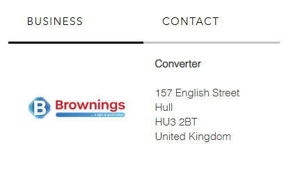
At SignComp Europe, we’re proud to be partnering with reputable businesses in the signage industry. Our partners directory page has a cohesive layout which makes it simple to explore companies that find solutions using our products. Each partner has their own digital ‘business card’ with a micro interaction that allows you to explore their logo, contact and key information.
Search bar
We were holding back users from exploring all we had to offer efficiently - That’s why it was vital to add the search bar. We hope this element improves usability, so you find what you’re looking for quickly. That means less clicking around!
Live chat feature
We know that our customers are busy people. If you are on the go, or have a question for us, our live chat feature will enable you to contact our friendly team in real time, no matter where you are.
New look, same SignComp Europe
The big question is, what does this mean for our customers? Whilst our look and feel has changed, SignComp Europe’s ethos and work ethic stays the same. We’ve not moved house, just simply refurbished to reflect our growth in the last 30 years. So, whether you’ve known us for a while or new to us let us know what you think!
%20PNG.png)


Comments